 As you may have noticed - especially if you've been hanging around Pen to Paper for a while now - that Friday night saw a completely new design for the blog!
My wonderful boyfriend, Matt, has been working on this for me for quite a while, but we decided that the first design was not quite what I had imagined for the blog, and something a little different than what we had originally planned would be better. After a rough sketch that we worked on together earlier in the week, the design is finally finished, and I have to say, I absolutely adore it!
If you all don't mind, I'm going to tell you a little bit about my boyfriend and his work, and I hope you'll head over and take a look at some of his other stuff on his tumblr blog.
Matt studied a degree in Visual Communication, specialising in illustration, which he graduated from with a 2:1 with honours in June 2011. Since then he has illustrated a Children's picture book, which was written by his Dad, and is hoping to have published, or get self-published in the very near future. I will, of course, be letting you all know when this is available, so you can take a look!
Apart from illustrating this book, he has worked on other, smaller projects, such as album covers, promotional posters (for my own University award - see the Wonder Woman poster on his blog), and other such personal projects in order to build up his portfolio. One of his pieces was even featured on the MTV programme 'A Tribute to Ryan Dunn'!
The design for Pen to Paper is just the latest project in his ever-increasing portfolio of work!
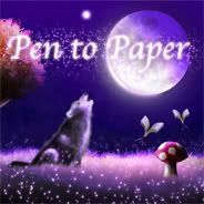
You can click on my blog button image at the top of this post to visit his tumblr, or CLICK HERE.
What I decided I wanted for the new blog design was an element of fantasy and fairy tale. I don't always review fantasy novels on the blog, as you may well know, but they are my preferred genre, so I wanted something that would reflect that. I love reading urban fantasy, and have a real soft-spot for werewolves or any other shapeshifters (plus, I just love wolves in general), so the wolf howling at the moon, no matter how cliché, was a must! I also knew that I wanted book-butterflies - or bookerflies, as I have taken to calling them - somewhere in the design. Originally these were going to be lounging around on the top of some flowers, but I think what Matt decided to do with the toadstools is perfect - there aren't many things that scream 'fairy tale' louder than a toadstool. Add to that a sprinkling of fairy dust and some enchanted-looking, knarled, old trees, and you have the perfect Pen to Paper recipe. You may see a few tweaks to the design over the next few weeks as we settle into the new look, but I hope you like the look as much as we do!
 I can't publish this post without giving a nod to Vicky from Books, Biscuits & Tea. Vicky not only runs this wonderful book blog, but she also runs a blog that designs blog layouts for other bloggers such as ourselves.
 Her design blog is called Sweet Dreams Design, and although she's only just started out, it's already obvious that her work is really beautiful.
As you already know, Matt designed the new blog header, page buttons, background (although this may be changed soon) and blog button - Vicky, however, was the one who put the whole thing together. And it's put together so beautifully.
You can visit her design blog by clicking the image, and you can visit her book blog by clicking here.
So, what do you guys all think of the new blog design? I feel like the new look has given the blog another step up, and hopefully now we will now continue to grow!


11 comments:
I love it!! I'm a sucker for wolves soo.. It really doeslook great! He's a very talented artist!
We've recently undergone a name change and a look change, which we're still tweaking a bit, but I love it so much more!
owl-read-it.blogspot.com if you want to check it out. I wanted to add stars to the background, but figured I would try something simple for now :)
But I seriously love your new look!
i loved it nd i was hooked on the wolf ^^;;
Aw, thanks for the shout out hun! *hugs* Matt did a great job and I'm glad I could help you! :) xxx
I love it - it all looks really pretty
Very nice! It's good to have something different to everyone else :)
LOVE The flying books. What a nice personalized touch! Did he use clipart or draw all the elements himself?
He drew everything himself, Maria.
I'm so glad that the new design is going down well! I'm really proud of it!
That is astonishingly beautiful!! I wish I could afford commission work - I would certainly know who to turn to if I could. :) So gorgeous!
Once Upon A Time
Awww this is beautiful Dani. xx
The drawings are great! He should consider uploading some of his designs to depositphoto.com for use in covers and other artwork (for sale). It's one of the places I've shopped to get clipart. He can load separate images (like the toadstools or the trees as separate clipart pieces.) We are always in need of more clipart for designs!!!
Post a Comment
Thank you for taking the time to comment on my blog - it is always appreciated!